Two MetrixLab slides before and after redesign, showing the client notes beside the completed presentation layouts

Client

MetrixLab

Scope

Presentation Design

Presentation Design

Presentation Design

Slide Deck

Slide Deck

Slide Deck

Data Visualization

Data Visualization

Data Visualization

Project Goal

Redesign a PowerPoint research presentation with consistent layouts, clear charts and typography aligned with the client’s brand.

The Challenge:

The client needed more than just a design refresh, they wanted:

  • A fully cohesive visual style

  • Improved data visualization

  • A polished, professional look

  • Fast turnaround with strong communication

All of this had to be completed in 48 Hours, leaving very little room for back-and-forth.
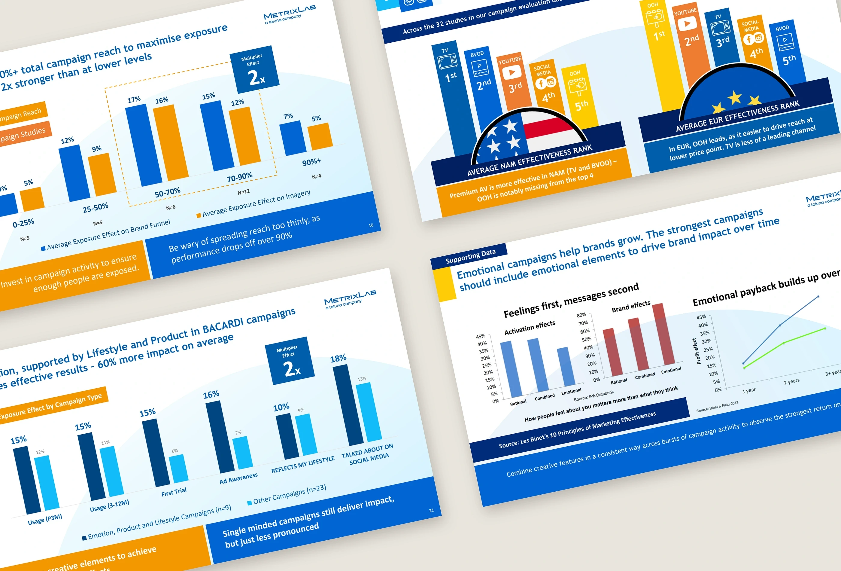
Four MetrixLab presentation slides showing charts, campaign comparisons and research data visualisation

The Solution:

I redesigned the slide layouts, color scheme, charts and visuals to create a consistent visual hierarchy. The process included an alignment call and collaboration with the client on the content and design.

I reorganized the supplied material into consistent slide layouts, refined the typography and redesigned charts for readability. The deck uses the client’s colors and a clear hierarchy for research findings, with revisions based on client feedback.

MetrixLab redesigned Key Media Principles slide with four clearly structured research findings
MetrixLab redesigned supporting-data slide showing research charts and a clear written takeaway

The Result:

The completed PowerPoint presentation uses consistent slide layouts, brand colors and redesigned charts and visuals.

Client Feedback:

Excellent work. Very collaborative from the beginning. Went that extra mile to match colour schemes, visualize data and make the presentation more impactful. Went above and beyond which was appreciated.

Avatar

Andrew Goodban

Managing Director MetrixLab